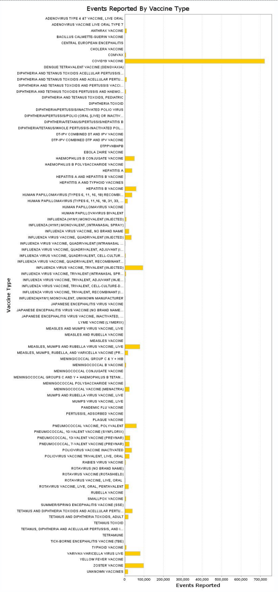
Here’s a chart I requested from the CDC’s VAERS (Vaccine Adverse Events Reporting System) website. (Keep in mind that these are totals for events from 1990 up to December 10th of this year, and that the COVID vaccines have only been around for 18 months or so.)

6 Comments
So they just felt shitty the next day, like we did?
If it were only that, we’d see gazillions of events listed for the flu (and other) vaccines, I think. But the criteria are not precisely defined. Whatever the criteria are, though, the COVID vaccine adverse-event report numbers tower over all the others.
I refer you to the FAQ.
So these are absolute numbers? Any data on the reactions as percentage of doses administered?
cmatt: there is a “percentage” setting, but it appears to show the percentage of each vaccine’s contribution to the total of adverse events across all vaccines.
I’ve found that you can filter by the type of adverse symptoms, and one of these is death. For COVID vaccines, the chart shows 10,818 deaths. The next highest is Haemophilus B Conjugate Vaccine, at 1,371. There are a few others in the hundreds (mostly the low hundreds). Most of the rest are in single digits.
So the COVID vaccines are in the lead by at least an order of magnitude – and don’t forget that we are just looking at an 18-month span for the COVID vaccines.
I invite you all to play with this tool yourself; you can start here. Begin by entering your criteria on the “Request Form” tab, then fine-tune the display on the “Chart” tab.
Thanks.
Quite an astonishing graph. I can’t help but think that if such a stark metric favored the ruling narrative, it would be trumpeted constantly by the usual Party news organs.